Brand Identity Design, User Experience + User Interface Design
Creative Pulse
This visual brand identity helped Creative Pulse sell hundreds of event tickets with one third of the work as well as doubled their social media reach.
Creative Pulse had built a thriving community for Vancouver’s professional creatives—but it didn’t have a visual identity that resonated with its monthly event audiences.
I worked with their founder to uncover the key messages that their logo should communicate: connecting like-minded creatives in a casual environment.

LOGO DESIGN

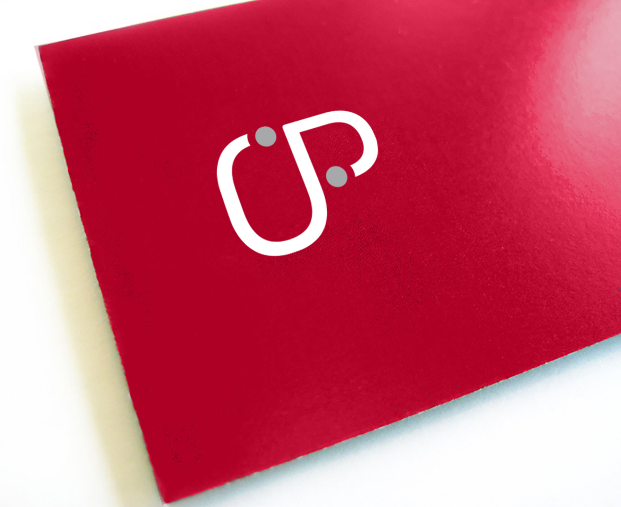
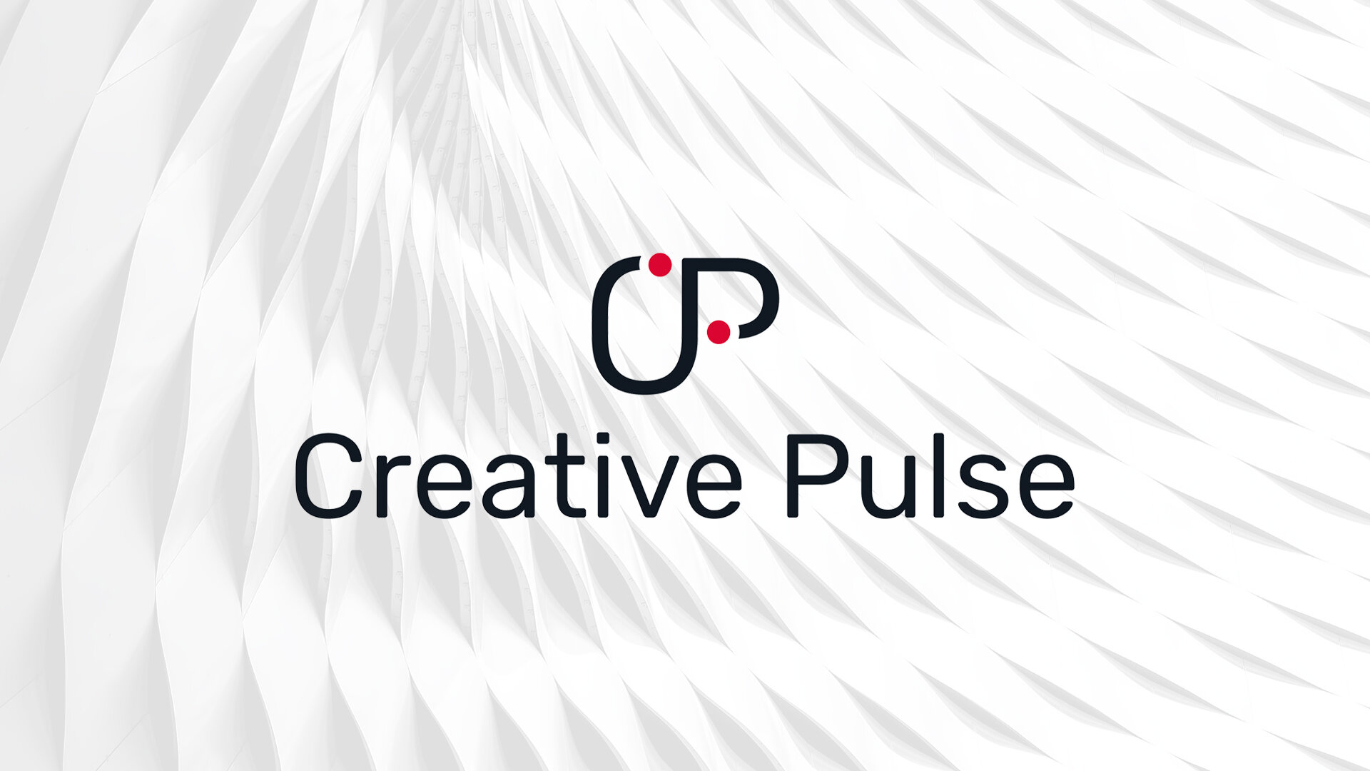
After drafting several concepts, we chose a logo that subtly included the idea of “connecting the dots”, visually conveying the professional path and relationships built throughout a creatives career. If you look closely, you’ll also see that the letters form a beer stein—a playful nod to the casual atmosphere that Creative Pulse works hard to foster at each event.
This logo and the accompanying visual identity appeals to the advanced tastes of creative professionals. Immediately after the release of the new brand identity, the Creative Pulse team noticed an increase in event promotion shares via email and on social media.
Prior to this visual identity, it would take an average of 3 promotional emails to sell an event. Now, one year after the release of this identity, it takes just one email to sell out!

DESIGN COLLATERAL
—
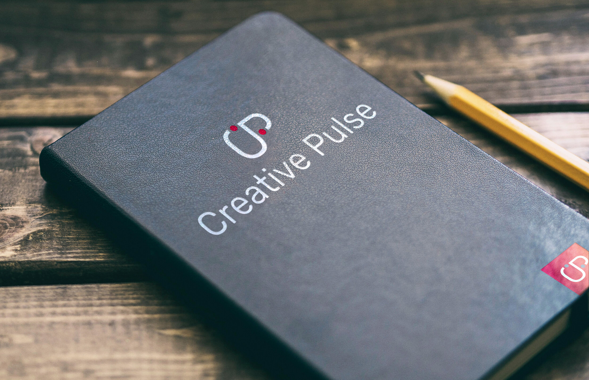
With a growing Creative Pulse network, there was an opportunity to build awareness outside of the networking events, through various promotional pieces that echoed the principals of the fun and accessible atmosphere.


VISUAL LANGUAGE
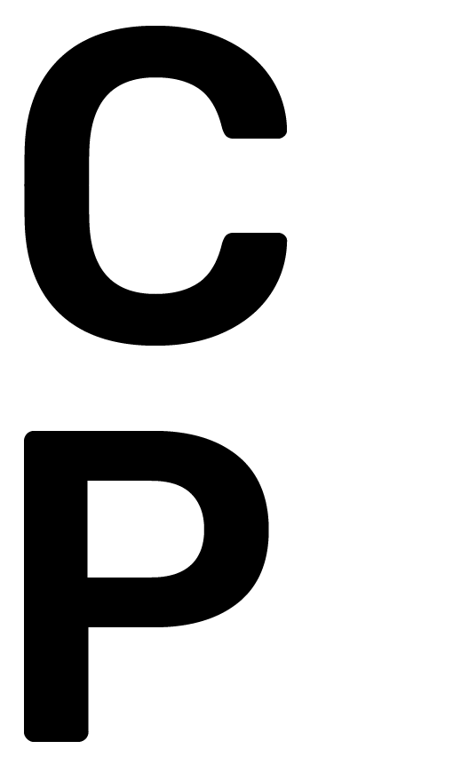
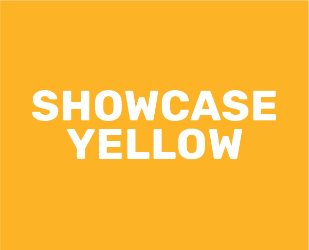
The colour palette was developed to represent the passion and drive that individuals within the creative community embody. It was important to convey energy, vibrance, and diversity within the Creative Pulse brand, as these are embodiments of creative professionals. This is paired with Rubik and IBM Plex Serif typefaces to create a bold, modern and sophisticated aesthetic.
TYPOGRAPHY
GLYPH
CHARACTERS

Primary

Secondary
STYLES

COLOUR PALETTE




DIGITAL
—
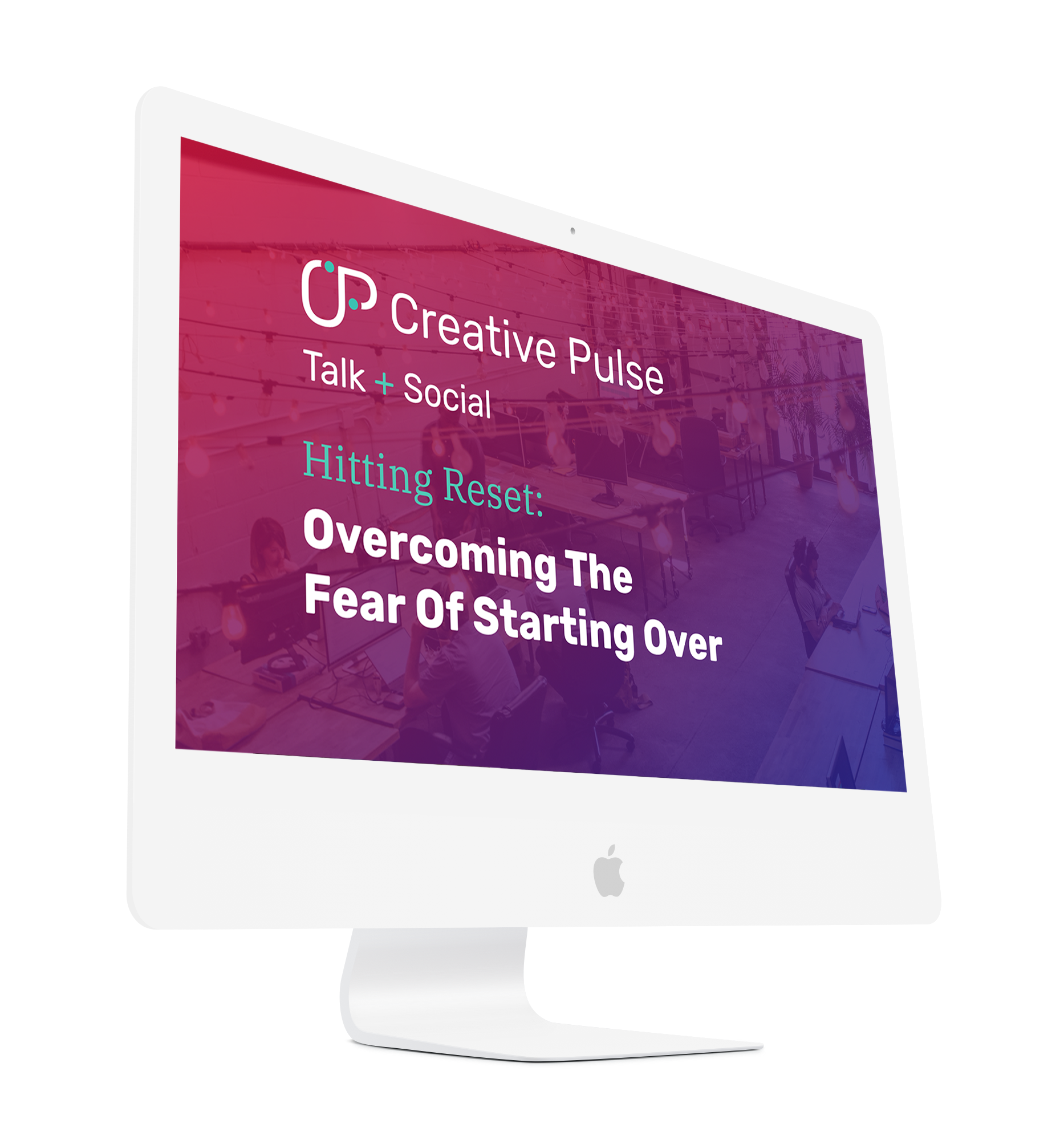
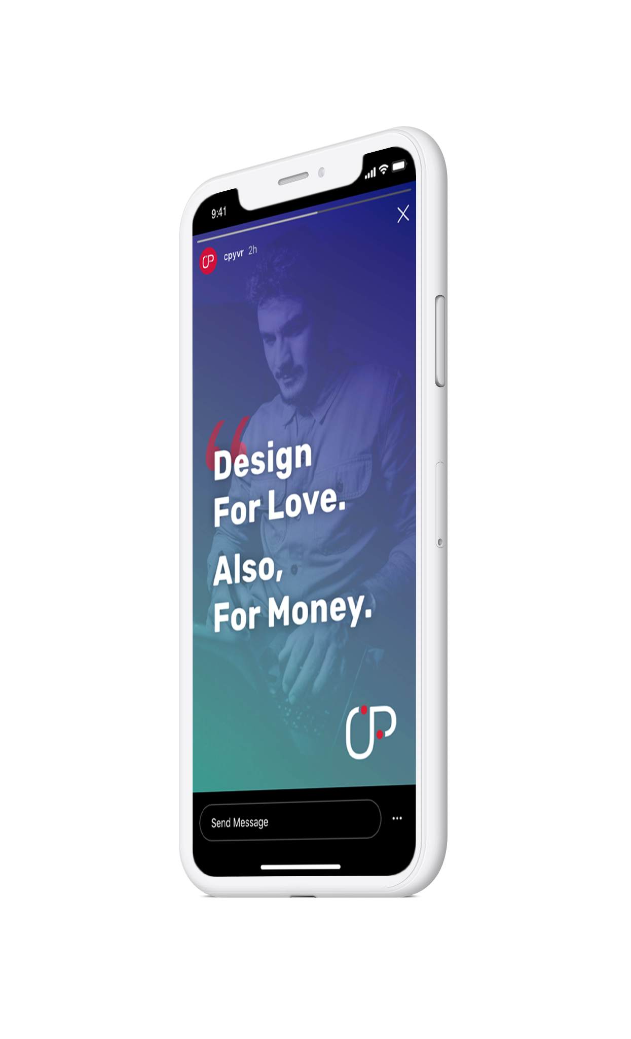
As the Creative Pulse network grew, so it the need for an online presence that supported increased ticket sales, social engagement, and the forum to introduce new services to the Creative Pulse community.



—
Creative Pulse's print pieces echo the bold colours and modern type treatment, ensuring that the playful and intense aesthetic resonates in all collateral.

