User Experience + User Interface Design
Glacier Media
We worked with Glacier Media to develop a new website that helped to articulate their complex organizational structure, business portfolio, and history succinctly.
Glacier Media Inc. is a people-driven, tech-enabled, diversified business intelligence and consumer information portfolio company.
We worked with their leadership group to distill their complex organization and strategize the information structure of their new website to streamline the visual story-telling.
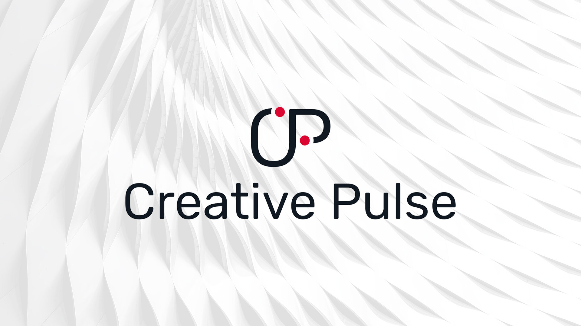
After drafting several concepts, we chose a logo that subtly included the idea of “connecting the dots”, visually conveying the professional path and relationships built throughout a creatives career. If you look closely, you’ll also see that the letters form a beer stein—a playful nod to the casual atmosphere that Creative Pulse works hard to foster at each event.
This logo and the accompanying visual identity appeals to the advanced tastes of creative professionals. Immediately after the release of the new brand identity, the Creative Pulse team noticed an increase in event promotion shares via email and on social media.
Prior to this visual identity, it would take an average of 3 promotional emails to sell an event. Now, one year after the release of this identity, it takes just one email to sell out!
VISUAL LANGUAGE
The colour palette was developed that represented the Wholistic focus Dr. Patricia Mills utilized to improve the health of women she worked with. It was important to convey strength, vibrancy, intelligence and stability within the Dr. Patricia Mills brand, as these repsresent Mr. Mills and her practice. This is paired with the Rubik typefaces to create a unique, geometric and organic aesthetic.
TYPOGRAPHY
GLYPH

CHARACTERS
Primary

Secondary

STYLES


