Brand Identity Design, User Experience + User Interface Design

Dr. Patricia Mills was in the process of growing her Women's Wholistic Health practice. But needed a visual brand identity that conveyed her values and perspective to her potential cleints.
I worked with Dr. Patricia Mills to portrait the key messages that her logo should communicate: Providing Transformational, Personalized Health Strategies Designed Specifically for Women.
LOGO DESIGN


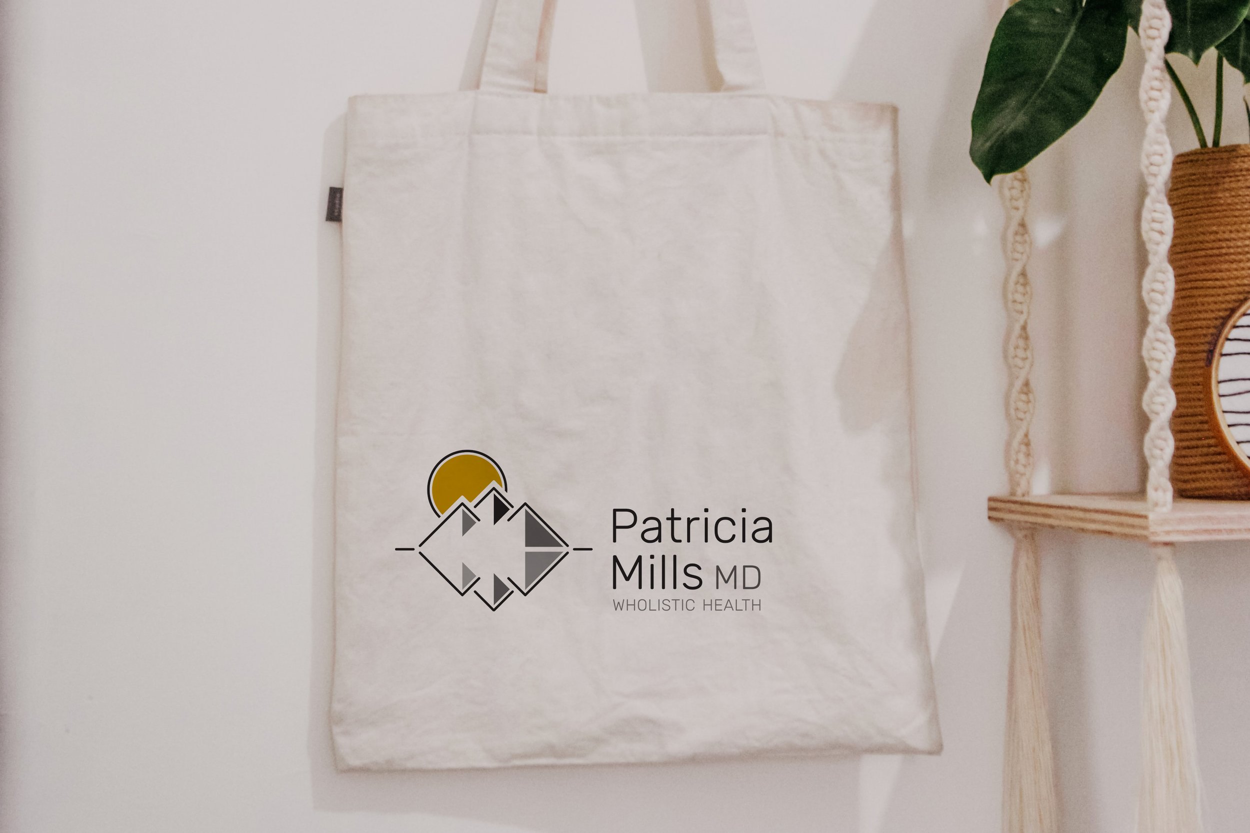
After drafting several concepts, we chose a logo that pays homage to her rustic and beautiful family property, where her family and friends gather to reconnect with each-other and nature. The simple line work of the logo is inspired by sacred geometry and are patterns that form the fundamental templates for life in the universe.
This logo and the accompanying visual identity appeals to women and natural health practitioners. With this new brand identity Dr. Patricia Mills’s business quickly grew, bringing in new clients and developing partnerships wth other like-minded health professionals.

DESIGN COLLATERAL
—
With a growing client base, there was an opportunity to build awareness outside of the virtual world, through various promotional pieces that aligned with the principals of Dr. Patricia Mills's Wholist health services.


VISUAL LANGUAGE
The colour palette was developed that represented the Wholistic focus Dr. Patricia Mills utilized to improve the health of women she worked with. It was important to convey strength, vibrancy, intelligence and stability within the Dr. Patricia Mills brand, as these repsresent Mr. Mills and her practice. This is paired with the Rubik typefaces to create a unique, geometric and organic aesthetic.
TYPOGRAPHY
GLYPH

CHARACTERS
Primary

Secondary

STYLES

COLOUR PALETTE


DIGITAL
—
As the Dr. Patricia Mills's business grew, so did the need for an online presence that supported all of her social media engagement, this website needed to connect users to all online content available.


